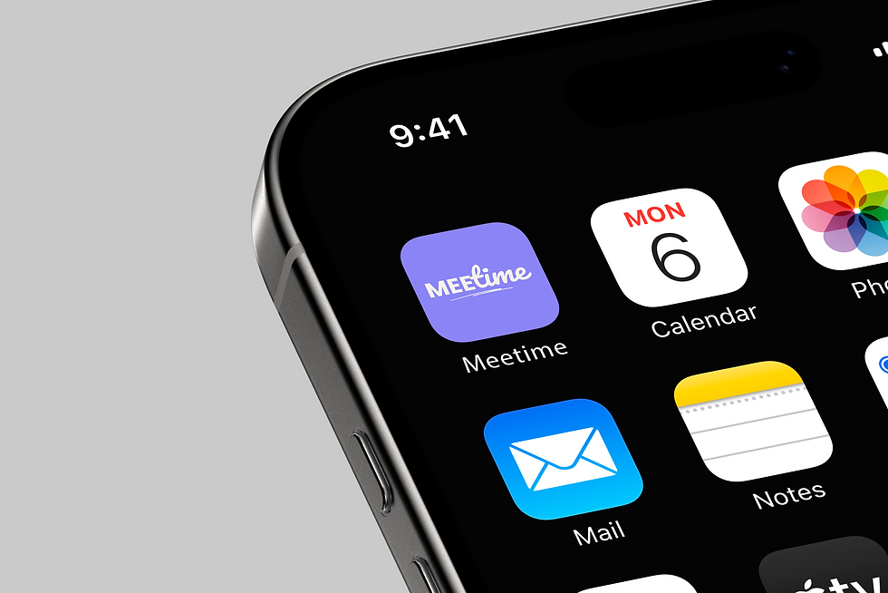


Built for real life, Meetime helps users slow down and check in with themselves, one feeling at a time. The app offers a kind, intuitive space to name emotions, track patterns, and build self-awareness through simple daily rituals.


Challenge:
Many people struggle to regularly check in with their emotions or prioritise mental self-care in a structured, non-intimidating way. Existing apps often focus on clinical frameworks or daily journaling habits that feel time-consuming, repetitive, or overly prescriptive.
User:
Young adults (18–35) juggling busy schedules, high emotional load, and digital fatigue, looking for a quick, meaningful way to understand their mental state, log how they feel, and get lightweight support when needed.
Opportunity:
Design an emotionally intelligent, minimal-effort app that makes self-reflection feel natural, engaging, and actually useful, like a mini mental reset, not a chore.
Meetime: A Toolkit for the Mind
Check In with Your Emotions.
A space to pause, notice your feelings, and gently reflect, without judgement.


Supportive UI.
What Users See on a Hard Day
Track Patterns, Not Perfection.
From quick emoji taps to deeper reflections, check-ins are simple, consistent, and personal.


Onboarding That Centres Empathy.
A simple daily ritual to reconnect with the parts of yourself you often rush past.
Built for honesty,
not perfection.


UX Decisions
-
Abstract visuals, not rating scales:
Emotions are shown through colour and shape, making mood tracking feel creative, not clinical.
-
Optional reflection, no pressure:
Users can just check in and leave, or write a note if they want. No guilt, no friction.
-
Micro-moments between screens:
I added subtle buffers (like bar animations) to slow the experience down and make the app feel more considered.
-
Gentle motivation via streaks:
Progress is shown softly, encouraging repeat use without making it feel like a game.
